
Below I will annotate an example using SQL to extract and chart some tablespace trending data using GNU Plot.
Oracle's Grid Control collects, stores, and manages historical metric data for hosts, databases, and all sorts of targets. This data is difficult to retrieve, especially the historical data. Creating a report in Grid Control results in a small bitmapped image. If you need, say, a year of CPU data, this small bitmap is difficult to interpret.
If the data is extracted from Grid Control's Oracle Management Service (OMS) then graphically representing the data can also be performed externally. One such tool that can be used to graph the data is GNU Plot.
Run the attached ts_trend.sql script. This SQL script can be run as SYS or SYSMAN.
You will be presented with a list of relevant targets in the OMS. Choose the one you wish to report on. We will look up the target's GUID by using its name.
SQL> @ts_trend

TARGET_NAME                    TARGET_TYPE
------------------------------ --------------------
DEVDB                          oracle_database
PRODDB                         rac_database
TESTDB                         oracle_database

3 rows selected.

db [TESTDB]> TESTDB

TARGET_GUID
--------------------------------
878988AC988DF897EA78907DA7876EED

1 row selected.
Next, choose the report's aggregation level, i.e. the distance between each plot on the x (date/time) axis. This will determine how data is grouped and plotted, and will determine the defaults of later parameters.
aggregation (y, m or d) [d]>

FORMAT
----------
yyyy-mm-dd

1 row selected.


Session altered.


DSTART     DFINISH
---------- ----------
2012-10-03 2013-10-03

1 row selected.
Now choose the tablespace to report on. Due to limitations in GNU Plot (multiple plot lines cannot be named by row data) I recommend that a single tablespace is chosen only.
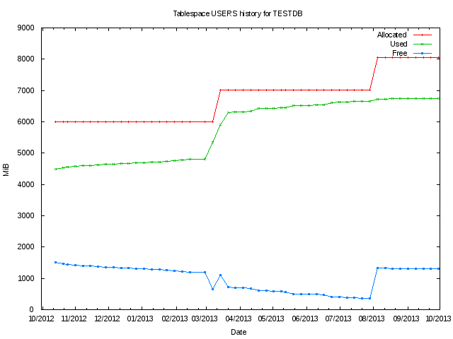
TABLESPACE
--------------------------------
DATA
INDX
SYSAUX
SYSTEM
TOOLS
USERS

6 rows selected.

ts [%]> USERS
Choose the range of dates to report on. These will default to produce a report on all the data in the last year.
start (yyyy-mm-dd) [2012-10-03]>
finish (yyyy-mm-dd) [2013-10-03]>
Now two files are created. The tabular data and the GNU Plot script definition.
Run the script through GNU Plot, then quit GNU Plot to create the PDF file showing the chart data. Note that the attached example files are for PNG format files for delivery to the web. The example below is for Windows. Unix systems are simpler as you can just run gnuplot filename.gp.
        G N U P L O T
        Version 4.6 patchlevel 3    last modified April 2013
        Build System: MS-Windows 32 bit

        Copyright (C) 1986-1993, 1998, 2004, 2007-2013
        Thomas Williams, Colin Kelley and many others

        gnuplot home:     http://www.gnuplot.info
        faq, bugs, etc:   type "help FAQ"
        immediate help:   type "help"  (plot window: hit 'h')

Terminal type set to 'wxt'
gnuplot> load "ts_trend_d_TESTDB_USERS_2012-10-03_2013-10-03.gp"
gnuplot> quit
Only when you have exited GNU Plot your file will be ready. These scripts can be adapted for many purposes such as capacity planning, management reports, and baseline comparisons, to name just a few.
| Attachment | Size |
|---|---|
| Host CPU min/average/max CPU trending SQL script (3.02 KB) | 3.02 KB |
| Database free/used/allocated space trending SQL script (4.02 KB) | 4.02 KB |
| ASM disk group space trending SQL script (4.25 KB) | 4.25 KB |
| Tablespace free/used/allocated space trending SQL script (4.9 KB) | 4.9 KB |
| Example tablespace trending tabular data (4.03 KB) | 4.03 KB |
| Example tablespace trending graphical chart (PNG) (4.8 KB) | 4.8 KB |
| Example tablespace trending graphical chart (PDF) (22.5 KB) | 22.5 KB |
| Example tablespace trending GNU Plot script (689 bytes) | 689 bytes |