
Oracle Database 12cR1 released
Oracle have released Database 12c Release 1 (version 12.1.0.1.0). Of particular note is the multi-tenant database facility. Each server has one container database (CDB), and that CDB may have one or more pluggable databases (PDBs).
Asus WL-500W serial to USB cable
Following an upgrade of Debian on my Asus WL-500W I had an unbootable system. Restoring from backups gave me some breathing space but I really needed to move forward with the Debian upgrade and find out why the system was not booting. Some instructions and some online and in-store purchases had me up and running just two days later.
Capacity trending graphs/charts in Oracle Grid Control
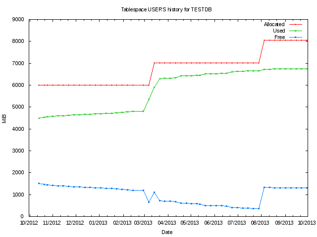
Below I will annotate an example using SQL to extract and chart some tablespace trending data using GNU Plot.
Oracle's Grid Control collects, stores, and manages historical metric data for hosts, databases, and all sorts of targets. This data is difficult to retrieve, especially the historical data. Creating a report in Grid Control results in a small bitmapped image. If you need, say, a year of CPU data, this small bitmap is difficult to interpret.
If the data is extracted from Grid Control's Oracle Management Service (OMS) then graphically representing the data can also be performed externally. One such tool that can be used to graph the data is GNU Plot.
Monitoring GoldenGate replicat performance using 'flashback query'
By using a checkpoint table in the OGG replicat database, you can retrospectively review the replicat's lag using flashback query (with some limitations if you do not utilise a heart beat table).
Picture the scenario. You receive observations that the Oracle GoldenGate (OGG) replicat system that you are responsible for had fallen behind overnight and all overnight processing was performed against incorrect data. What do you do? Perhaps the observation was erroneous. How can you demonstrate this?
MapReduce introduction (Linux Journal)
Linux Journal has published a simple to understand introduction to MapReduce using Hadoop. Definitely worth a read if you need an introduction.